
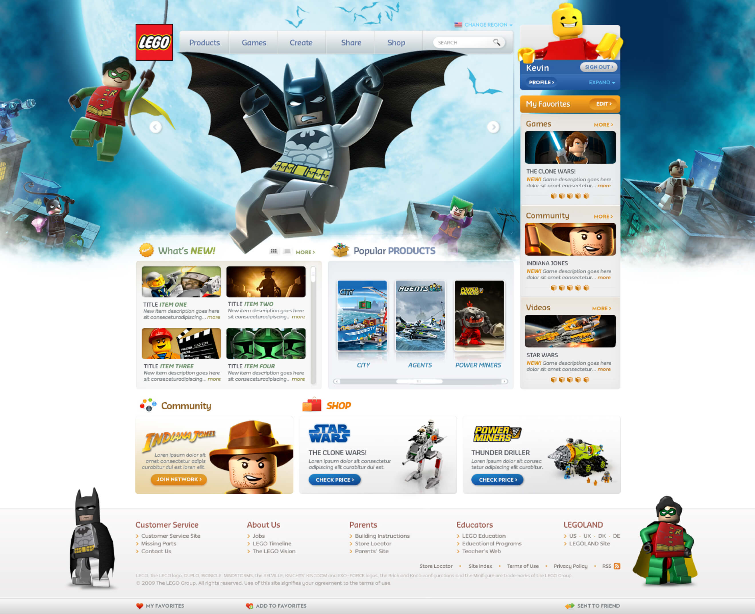
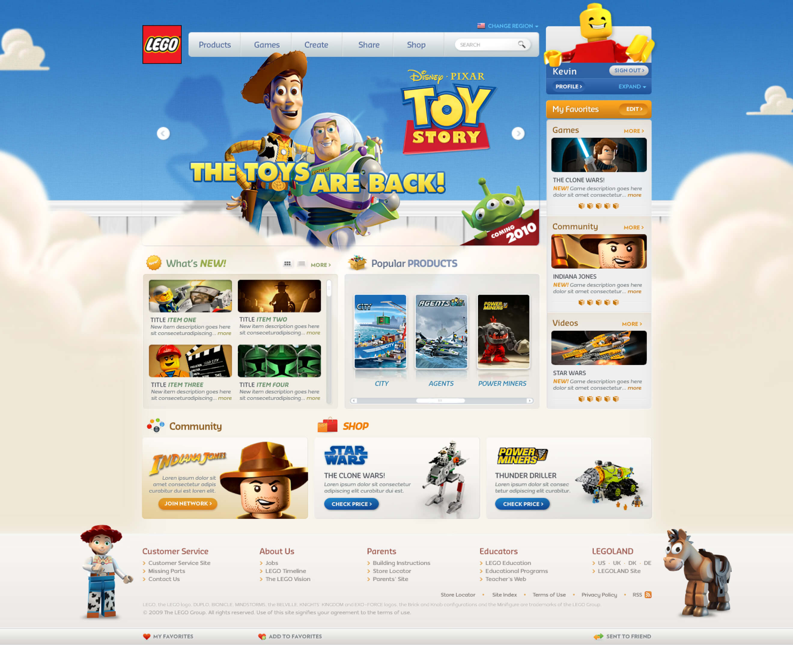
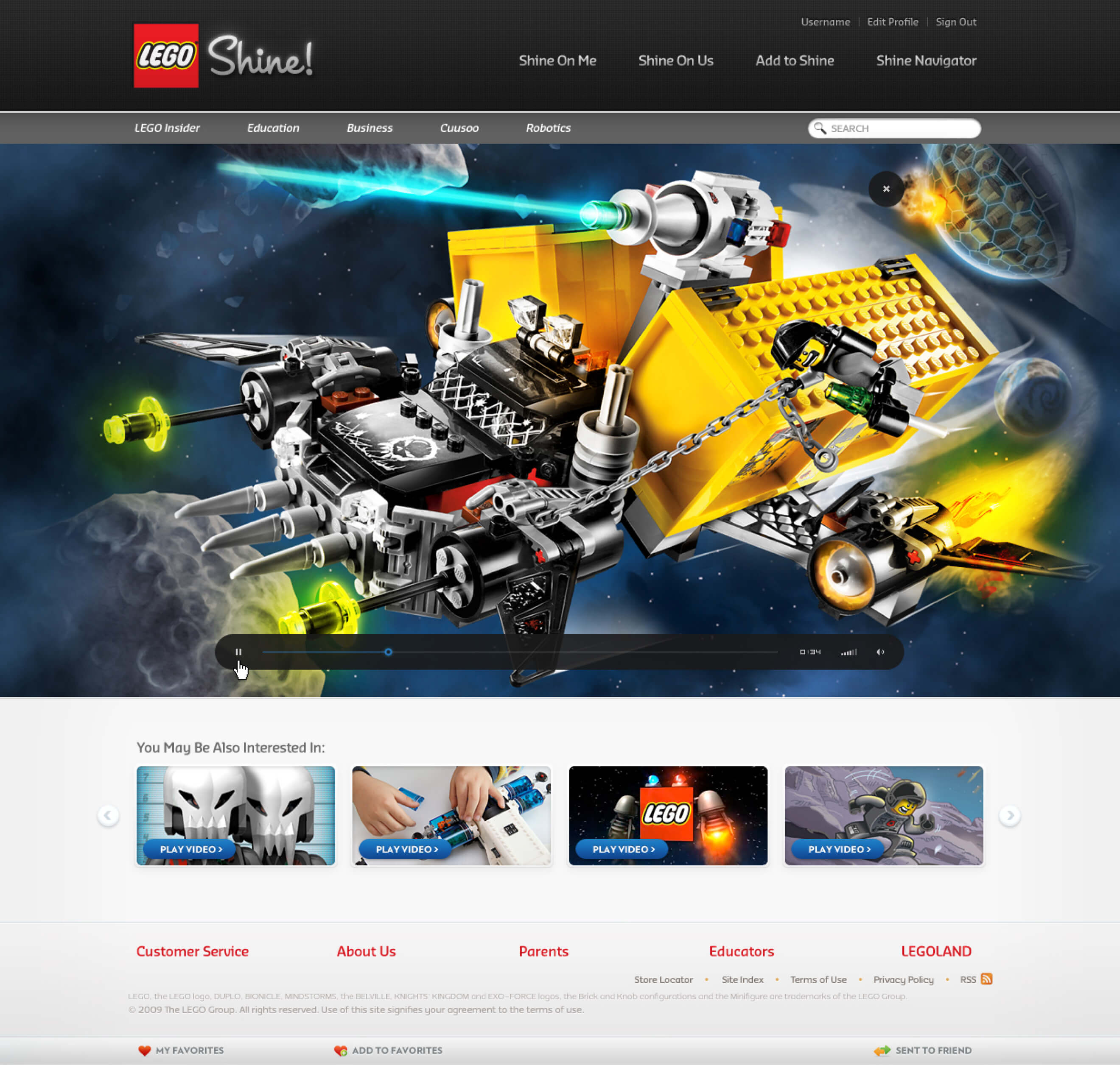
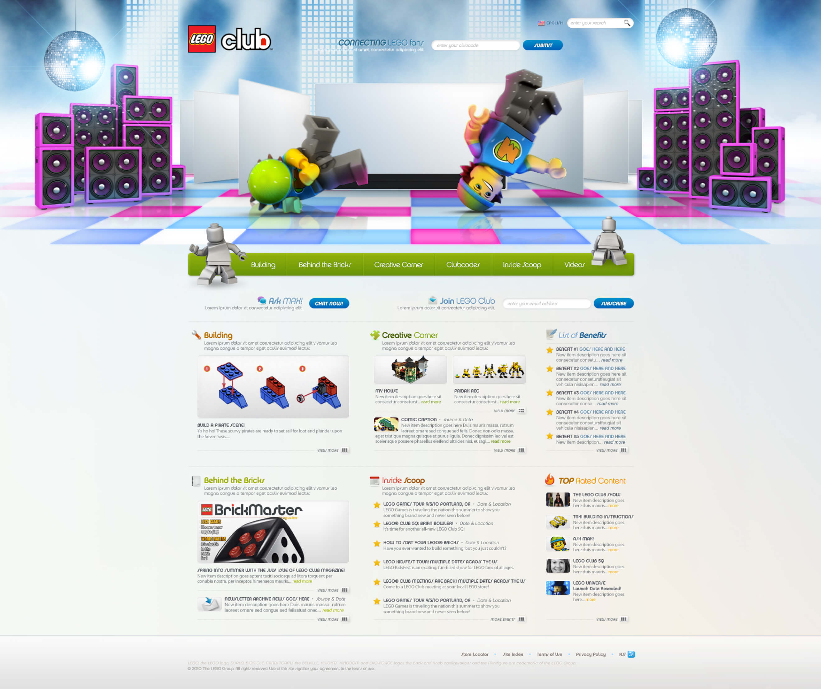
LEGO.com was attracting an average of 22 million users online monthly. The briefing was to create a fresh look and feel for LEGO.com’s web platform and give it a unique personality to stimulate its target audience.
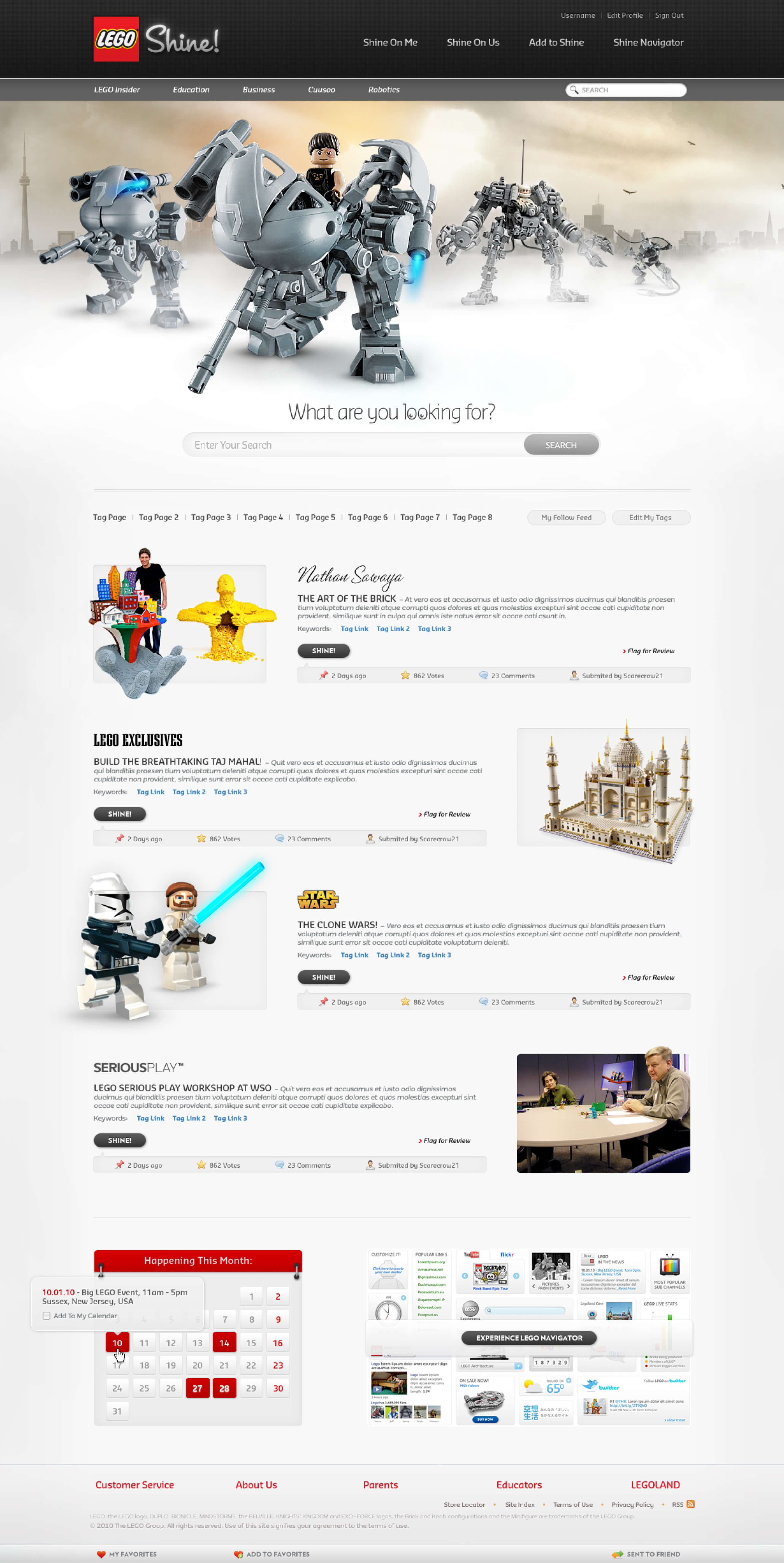
They wanted it to be a truly fun and exciting virtual playground that would keep the kids returning to the website. They wanted the redesign to convey The Spirit of LEGO. I was responsible for the Design Direction of Lego.com and other product websites.
Webby Award Winner ⎯ Best Home People’s Voice Winner ⎯ Best Home
Credits
- Alex Pico
- Ed Holmes